
Show Me the Data: Clinical Report Design Techniques
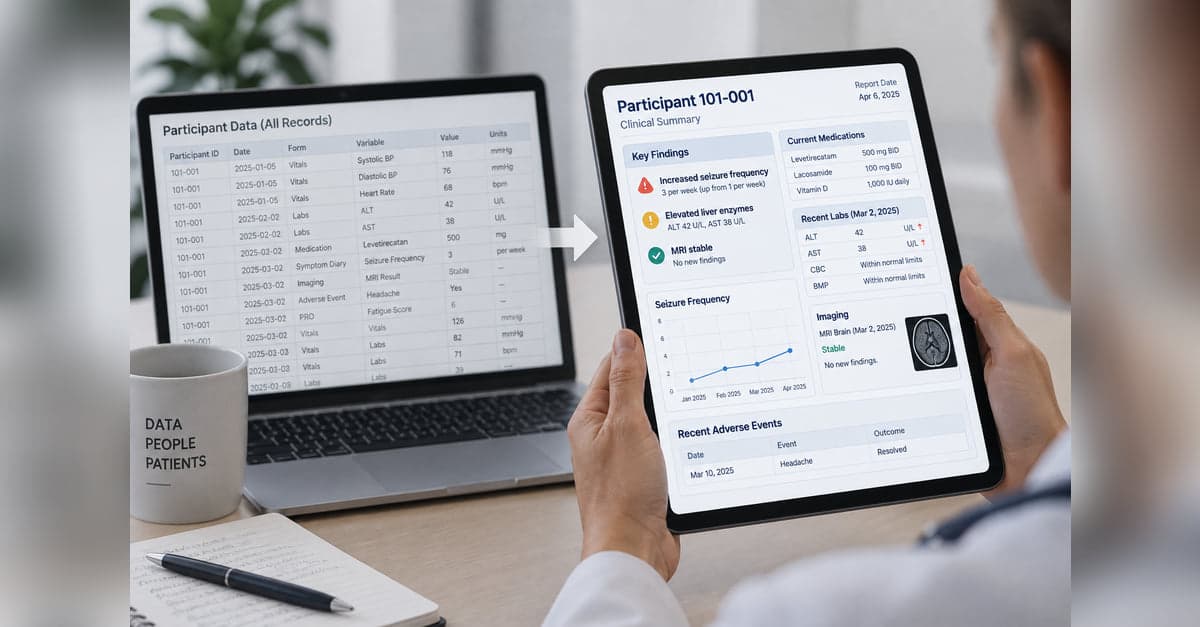
Collecting clinical data is one thing. Turning it into something people can quickly understand and use is another. This series explores practical approaches to clinical report design, from predictable, programmatic reports to AI-generated reports that adapt to the data and what matters for each patient.
Series learning objectives
By the end of this series, you'll be able to:
Decide what deserves attention
Organize, prioritize, and minimize information so important findings stand out while supporting details remain available when needed.
Choose how to represent the information
Use color, spatial relationships, graphs, tables, timelines, and other visual techniques to make meaning in the data easier to see.
Connect the big picture with the details
Summarize accumulated data while selectively bringing forward current values, meaningful changes, and individual findings that still deserve attention.
Design around how someone understands the case
Combine icons, color, visual scales, anatomy, and other representations around the patient and the task rather than simply presenting individual data points.
Decide what role AI should play
Use AI to help generate clinical reports while deciding how much direction to provide and where predictability, verification, reproducibility, and human review still matter.
We've all seen the report. Rows of dates. Columns of numbers. Labs, scores, medications, symptoms, visits, sometimes years of them.
The information is there. Finding what changed, and what matters now, is the hard part. You scan across a row, try to remember the value from six months ago, and hope the one finding that helps explain the current visit is not buried three screens down.
That problem can show up anywhere clinical data accumulate. It becomes especially important in patient registries. A registry may run for years, across visits, sites, and changing clinical circumstances. Eventually, a complete listing of everything collected is no longer the same thing as something someone can actually use.
Clinical research often puts far more structure around collecting data than around making accumulated data easy to understand while the work is still going on. Why wait until the end of the study, or until someone sits down to write a manuscript, before putting those data to work?
A useful clinical report has to make a few decisions: what deserves attention, how information should be represented, how the long view and the current finding fit together, and who is looking at the report for what purpose. AI can increasingly help create those reports, but it does not remove the need for predictability, verification, and human review.
- Part 1: What deserves attention
- Decide what belongs in the foreground, what can recede, and how supporting details remain available without competing for attention.
- Part 2: How should it be represented?
- Use color, spatial relationships, graphs, tables, timelines, and other visual techniques to make meaning easier to see.
- Part 3: Connect the big and small pieces
- Summarize what has accumulated while still surfacing current values, meaningful changes, and individual findings.
- Part 4: Build a picture of the patient and task
- Organize information around how someone needs to understand the patient and what they need to do.
- Part 5: Bring AI into the reporting process
- Explore how AI can generate reports, how much direction it should receive, and where predictability, verification, reproducibility, and human review remain important.
The goal is straightforward: don't just collect the data. Put it to work.
5 of 5 parts published
Show Me the Data: Clinical Report Design Techniques
Collecting clinical data is one thing. Turning it into something people can quickly understand and use is another. This series explores practical approaches to clinical report design, from predictable, programmatic reports to AI-generated reports that adapt to the data and what matters for each patient.
Clinical Report Design: What Belongs on Stage?
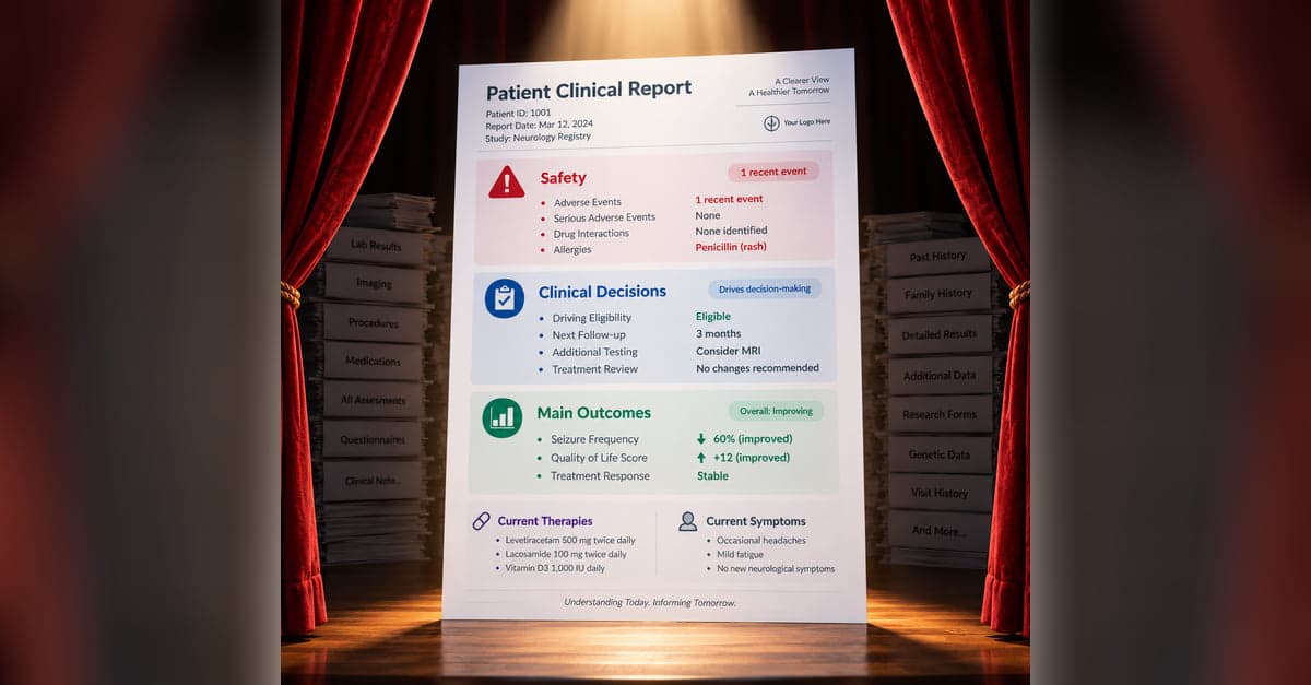
A clinical report can contain everything and still make the important information hard to find. Part 1 looks at how to decide what belongs in the foreground, what can recede into the background, and how to keep the details available when someone needs them.

Clinical Report Design: Ingredients of a Good Recipe
Once you've decided what belongs on a clinical report, the next challenge is deciding how that information should be represented. Part 2 looks at how color, spatial relationships, graphs, tables, timelines, and other visual cues can make meaning in the data easier to see.
Clinical Report Design: Connecting Big and Small Pieces
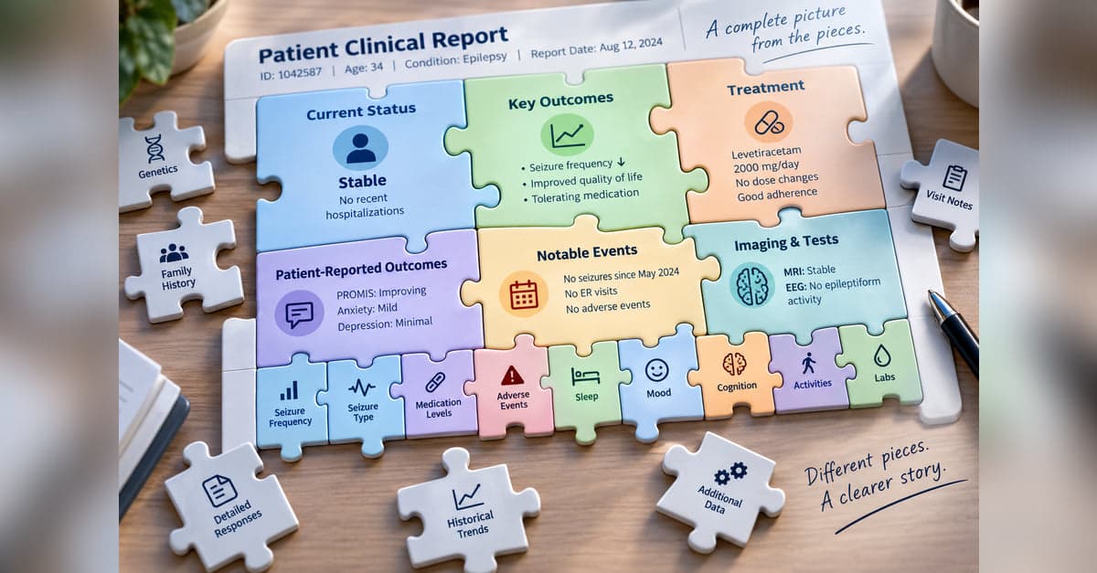
Years of clinical data can be difficult to understand one value at a time. Part 3 looks at how a report can summarize accumulated information and selectively bring forward current values, meaningful changes, and individual findings without losing access to the underlying details.
Clinical Report Design: A Picture Is Worth a Thousand Data Points
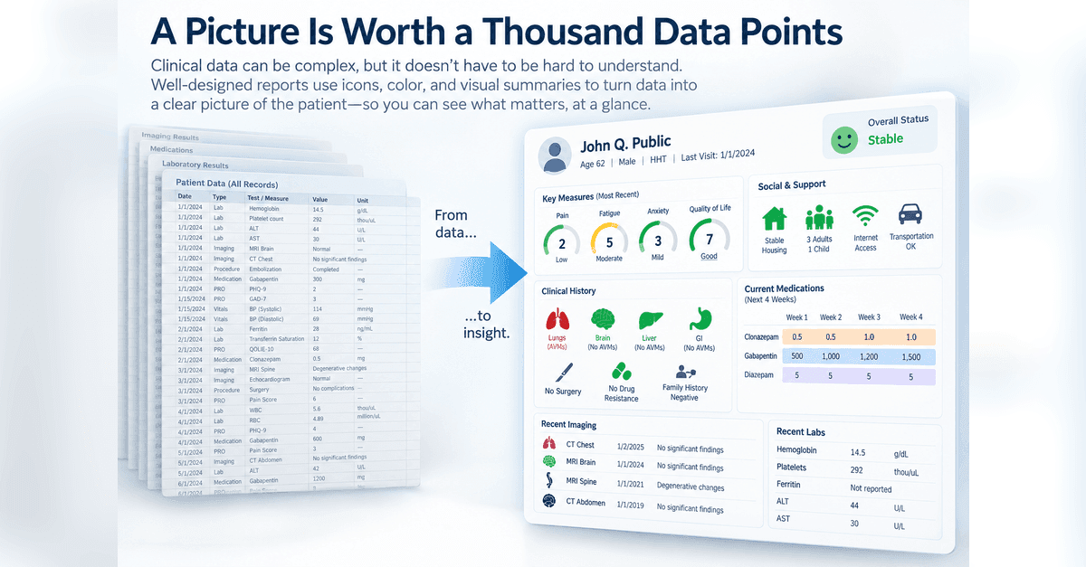
Clinical reports don't always need to make someone read numbers, scores, and text to understand what's happening. Part 4 looks at how visual representations can be combined into a larger picture organized around how someone understands the patient or what they need to do.
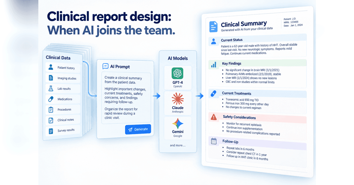
Clinical Report Design: When AI Joins The Team
AI gives us a new way to turn clinical data into something people can use, but it also changes who is making some of the design decisions. Part 5 looks at two approaches: giving AI detailed instructions for structured clinical notes and reports, or giving it more freedom to decide how information should be organized and visualized, while keeping verification, reproducibility, and human review in view.
Designing something like this yourself?
Tell us what you are building and we will show you how it maps onto Studytrax.
Get started